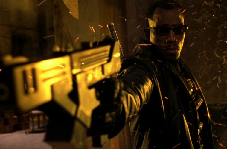
Guillermo del Toro is a master of production design and visual effects, that much is all but short of accepted, scientific fact. But what doesn’t get discussed quite as often in regards to his films is how his use of the camera connects with and relates to his production design. Specifically in regards to color. Del Toro’s use of color is almost completely unique in the Hollywood sphere. While other filmmakers are taking genre films and de saturating them to appeal to audiences more “serious” and “gritty” inclinations, Del Toro has only leaned ever further into his love of rich, lush color schemes. His ability to evoke mood and emotion via color alone is nearly unmatched in the filmmaking world today and it has only grown and blossomed in its maturity as his considerable career has gone on. “Pacific Rim” and “Crimson Peak” alone are masterworks of color, of lighting and of design. A three-way marriage of bold filmmaking choices that have paid off every time.
Vimeo user Quentin Dumas has put together a lovely supercut highlighting del Toro’s expressive use of color (below), organized by primary colors. If you needed any further proof that Guillermo is the premiere master of color working in film together, this supercut has your name written all over it.
Source: Quentin Dumas

